The Inventor of the Road Signs:
| Basic Information | Inventor’s information | Inventor’s information |
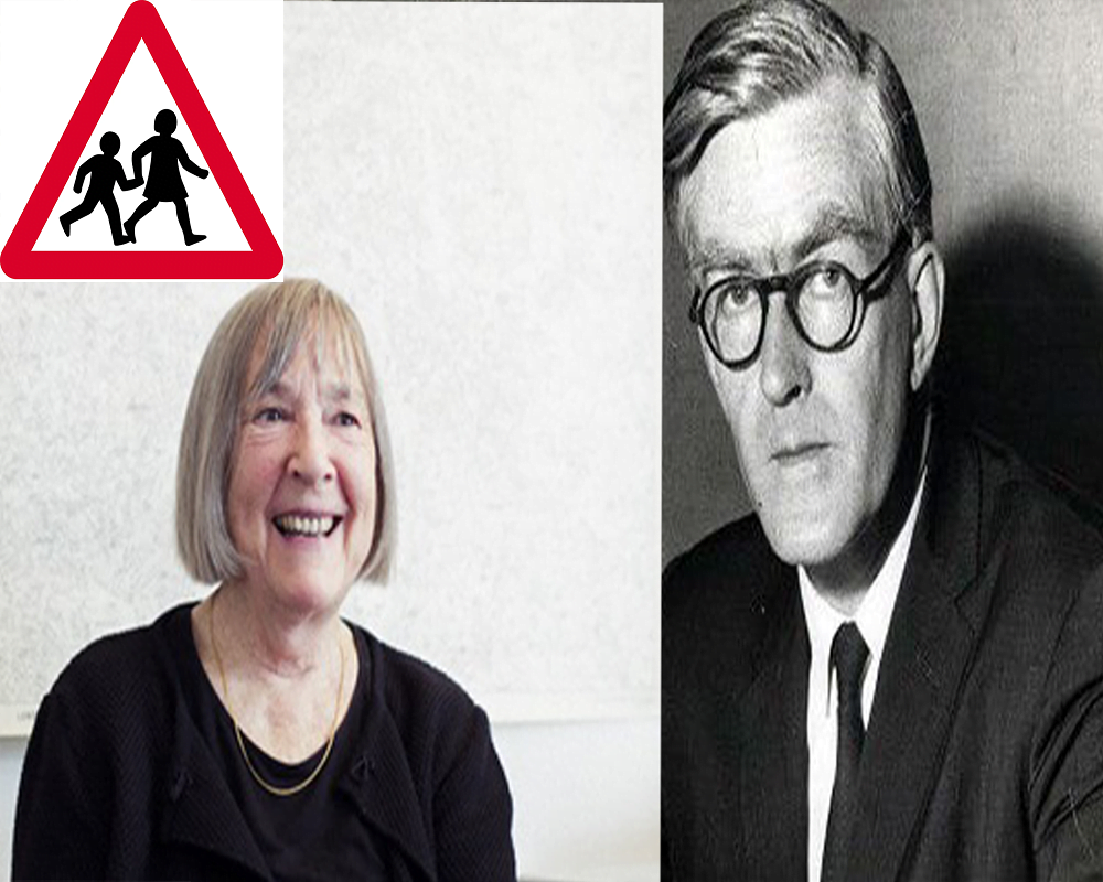
| Name of Inventor | Margaret Vivienne Calvert | Jock Kinneir |
| Nationality | British | English |
| Date of Birth | 1936 | 11th February 1917 |
| Place of Birth | Union of South Africa | Hampshire, United Kingdom |
| Date of Death | Alive | 23rd August 1994 |
| Place of Death | Alive | United Kingdom |
| Age | 84 years old | 77 years old |
| School | St Paul’s Girls’ School, London | N / A |
| University | Chelsea College of Arts, London | Chelsea College of Art & Design |
| Occupation | Typographer and graphic designer | Typographer and graphic designer |
| Career | 1957 – Present | 1950 – 1994 |
| Famous for | Design of Road Signs in the United Kingdom, Crown Dependencies and British Overseas Territories. | Famous for writing books for the public |
| Title | The inventor of Road Signs | Works for the public using Letters of English |
| Other works | UK Railway System | N / A |
| Awards | Officer of the Order of the British Empire | N / A |
| Famous Design | Road Signs designer of United Kingdom | Words letter designing |
| Books | N / A | Words and Buildings: The Art and Practice of Public Lettering |
Abstract:
It is necessary to know the road signs to avoid a collision. It is to be noted that human being’s life is very precious, so we have to save our life to invent some different methods. There are many ways due to which we can save our lives, in which some are given below. There is a female who made signs for the protection of human beings. Let’s talk about the inventor of the road signs. She became famous in the world that; her graphic road signs are being used.
Early Life and Education:
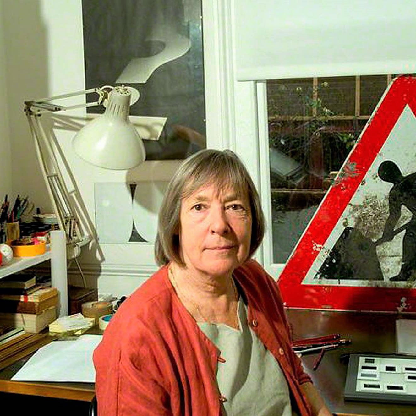
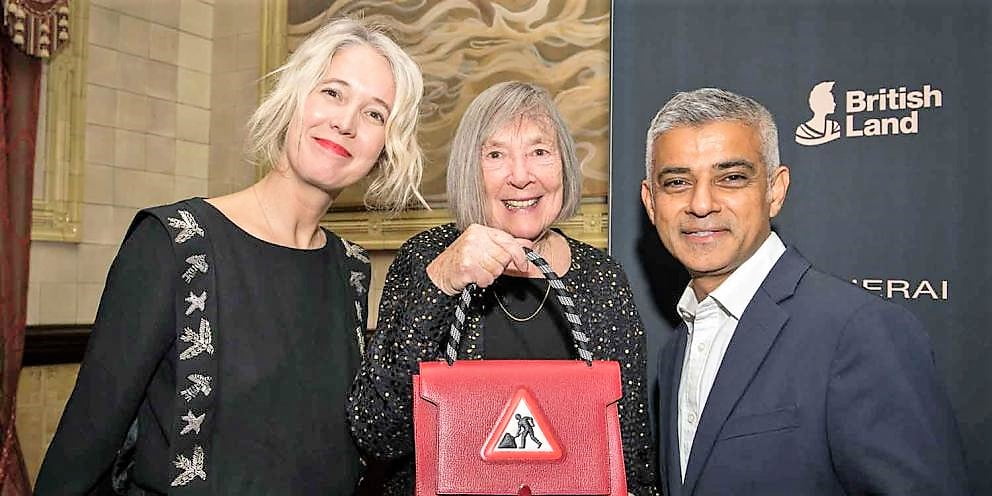
Margaret Vivienne Calvert is the inventor of the road signs, she was born in South Africa. She moved to England with her family at the age of 14 years old. She got an education from the school of St Paul’s Girls’ School, London[1].
Art Designing Tutor at Chelsea:
At there, she met with the tutor “Richard Jock Kinneir”. He insists on Calvert’s to contribution the design of the new route-finding techniques to go to the Gatwick Airport. Here the notorious black on the scheme was founded. At that time, there was a scheme running that was 60 years old[2].
Appointment of the Head of Signs in Britain:
In 1957, Kinnier was chosen as the head of the signs of the Britain roads and she became the biggest graphic designer job. She gave a briefing for the creation of the new signage system for the Britain roads. Now, it is called the iconic language which is used for learning the information signs. Calvert wanted to make it simple and easy so that everyone can understand them, Calvert helped the humans to understand graphic language which can be seen on every signpost and roadside sign which is good in the length and breadth of the country[2].
UK Road Signs in the year 1965:
As a feature of the new street signage framework, on the pictogram notice signs, Calvert would regularly put together these with respect to her recollections. The animal signs helped Calvert to remember her family members’ Warwickshire ranch and the younger students crossing sign was displayed on a photo of herself as a youngster. In what looked very ‘sentence structure school’, to make it more comprehensive she supplanted the picture of a kid in a school cap driving a young lady, with one of a young lady with a more youthful kid[2].
Railway Alphabets:
The rail letters in order typeface were intended for use on the British railroad framework. Comparable, however not indistinguishable from the generally utilized load of Helvetica, the typeface was first utilized at London’s Liverpool Street Station. It was then received by the Design Research Unit as a feature of their complete 1965 rebranding of the organization. The typeface became British Rail’s best and enduring component of their corporate character[2].
Motorway Lettering:
In 1958, Britain’s first motorway was opened, the M6 Preston sidestep. With this, an effectively fathomable and reliable typeface was required for signs and giving bearings on motorways. This vehicle textual style has been applied to each motorway sign the nation over from that point forward and is even utilized in different nations including Ireland and Portugal[2].
Before the advent of signs:
Every one of Calvert’s design became an integral part of the national landscape. It was difficult to understand when these signs were not existing[2].
Herbert Spencer and the Road Signs:
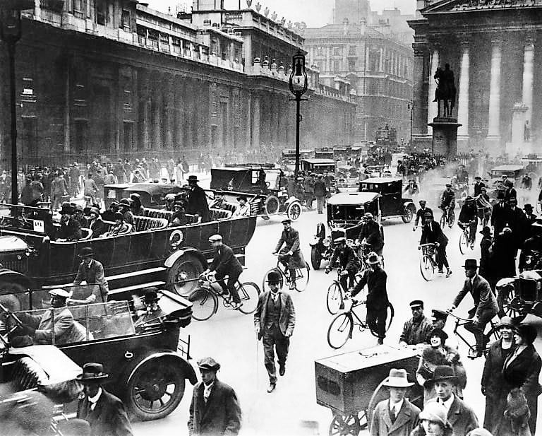
Committed to planning the careless province of British street signage at the turn of the 1960s, the visual creator Herbert Spencer drove from focal London to the as of late opened Heathrow London Airport and captured every one of the street signs that he went over en route. He at that point distributed the outcome in two photographic papers in progressive 1961 issues of his visual depiction magazine Typographica[3].
At that point, Britain’s streets were covered with plenty of signs appointed by different bodies. Throughout Spencer’s excursion, generally along the A3, he shot scores of signs each bearing various images, shadings, and typefaces. His articles demonstrate how disordered and befuddling British street signs probably appeared to drivers at that point. They likewise show why the requirement for a rational and effectively neat signage framework was so dire[3].
Jock Kinneir and his Right-hand Margaret Calvert:
The public authority of the day made the irregular step of entrusting the improvement of the new framework to the visual creator Jock Kinneir (1917-1994) and his right-hand Margaret Calvert. They conceived a thorough signage arrangement of painstakingly planned lettering, shadings, shapes, and images for Britain’s new motorways in the last part of the 1950s and any remaining streets in the mid-1960s. Proficient and exquisite, their framework was one of the most aspiring data configurations extends ever embraced in Britain[3].
Britain’s First Motorway in 1957:
At the point when he began to chip away at the signage for Britain’s first motorways in 1957, Jock Kinneir was at that point viewed as one of Britain’s most cultivated visual architects. Brought into the world in Hampshire in 1917, he contemplated etching at Chelsea School of Art from 1935 to 1939 and, after World War II finished, was utilized as a show creator by the Central Office of Information[3].
Worked for the Design Research Unit:
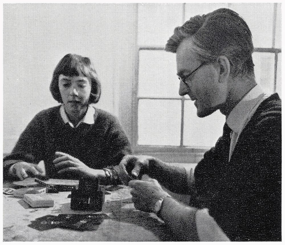
He at that point worked for the Design Research Unit, the multidisciplinary configuration bunch established by the antiquarian Herbert Read, before opening his training in 1956 and showing low maintenance at Chelsea. Kinneir won his first enormous bonus to plan the signage for Gatwick, the new London air terminal, after meeting one of its draftsmen Yorke, Rosenberg, and Mardall in a transport line. He requested one from his understudies at Chelsea, Margaret Calvert, to help him with the undertaking[3].
Road Signs in
Brought into the world in South Africa in 1936, Calvert had moved to England as a youngster and spent significant time in outline when reading for her National Diploma in Design at Chelsea. Kinneir utilized her to help produce the work of art, maquettes, and drawings for Gatwick. “An employment like Gatwick implied something at that point”, she later told the plan history specialist Rick Poynor. “It was truly spearheading. You truly put stock in it and needed to be essential for it not in the feeling of greatness. It was essentially exciting to assemble.” [3]
Colin Anderson, P&O-Orient Line Transporting:
At the point when Colin Anderson, the executive of the P&O-Orient Line transporting organization read about the Gatwick signage in a magazine, he dispatched Jock Kinneir to plan stuff marking framework for P&O. Travelers frequently lost their gear since watchmen couldn’t translate the old names. In 1957 Anderson has then delegated the director of the public authority advisory group shaped to survey the marking required for British motorways and asked Kinneir to plan them[3].
Government Authority and the Motorway Construction:
The government authority was intending to assemble many miles of rapid motorways as a feature of an aspiring street development program. The current streets couldn’t adapt to the huge number of new British drivers who had begun to drive during the 1950s as vehicles, for example, the Morris Minor and Mini, turned out to be more affordable and more effective. The plenty of various street signs was the best-case scenario, confounding and even from a pessimistic standpoint perilous to Britain’s drivers, and took steps to be especially so when driving at rapid on a motorway. As the requirement for motorway signage was so pressing, the public authority chose to handle it first before modernizing other street signs[3].
Committee made by Anderson:
The individuals from the Anderson Committee headed out around Europe to survey how various nations were tending to the issue. Generally, they discovered indecipherable signs planned in capital letters as an after-suspected by the designers delegated to develop the streets. By moving toward the issue from a data plane point of view, Kinneir and Calvert set about building up an intelligent framework that would be as simple to peruse – and comprehend – as could be expected under the circumstances. Kinneir said that he began with the inquiry: “What would I like to know, attempting to peruse a sign at speed” “Style never came into it,” reviewed Calvert. “You were driving towards the total pith. How is it possible that we would lessen the appearance to bode well and least expense”? [3]
Framework establishment:
Their framework was established in the idea of numerous signs appearing as a guide of the intersection ahead. Presuming that a mix of upper- and lower-case letters would be more clear than ordinary capitalized lettering, they built up another typeface, a refinement of Aksidenz Grotesk, for use in the signs. Later named Transport, it is unmistakably current as a san’s serif textual style, however, it is gentler and curvier than the dull innovator lettering utilized on mainland European street signs. Kinneir and Calvert felt that these characteristics would cause it to appear to be more amiable and additionally speaking to British drivers[3].
Understanding the Distances:
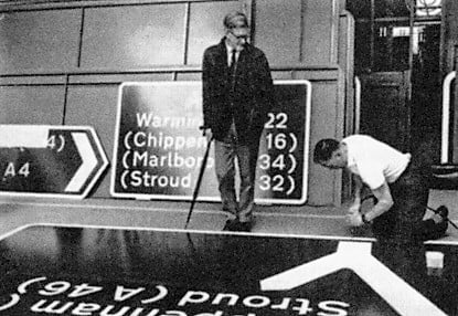
They tried the signs in an underground vehicle park and cries on the Knightsbridge side of Hyde Park and afterward in the recreation center itself, where the signs were propped facing trees to decide reasonable foundation tones and understanding distances. The principal public appearance of the new signs occurred in 1958 on the main motorway-standard street – the Preston by-pass in Lancashire (presently part of the M6) and the framework was affirmed. In spite of the protests of a modest bunch of moderate pundits that the signs were too huge and grating, they were considered a triumph. These were before long imitated on some informal dark foundation course signs on streets in Oxfordshire, pulling in rebuff from the Ministry[3].
Ministry of the Transport:
In 1961 T. G. Usborne, the Ministry of Transport official accountable for the Anderson Committee, shaped a panel to survey signage on any remaining streets. Sir Walter Worboys was enlisted to seat it, Anderson having declined the proposal to repeat his job. Jock Kinneir was authorized as the creator. In 1964 he made Margaret Calvert an accomplice and renamed his training Kinneir Calvert Associates[3].
Deal with the Association for the Street Signs:
Receiving a similar thorough way to deal with the association of data for street signs concerning motorways, they accumulated codes of deliberately picked shapes and tones. The codes adjusted to the 1949 Geneva Protocol of utilizing three-sided signs to caution drivers, circles to give orders, and square shapes to transfer data. Similarly, as their motorway signs comprised of white lettering against a blue foundation, they utilized white lettering for place names and yellow for street numbers against a green foundation on signage for essential streets and dark lettering against a white foundation for optional courses[3].
Advancement in the Motorway Signs:
Significant advancement of the motorway signs was the utilization of another material for the white lettering. This permitted them to be effortlessly perused around evening time by mirroring light from vehicle headlamps back toward the path it came from. The lettering in this way stood out well from the blue foundation, which being non-intelligent seemed dark around evening time, and could be perused from an extensive distance. The medium-weight textual style utilized was ideal for this as the mirrored light kept an eye on corona, causing the content to show up marginally bolder. However, the white foundation of signs on streets of lower significance had the contrary impact and would in general gush out over into the dark letter structures. For these, a bolder text style was required and Transport Heavy was conceived[3].
Transport Medium and the Diagrams:
Transport Medium (as it came to be known) was likewise refined and adjusted somewhat from the motorway variant. The characters of the two loads were given notional tile diagrams to encourage their right dispersing. While these layouts were identical to the assemblage of customary letterpress type, elective tile widths were recommended for specific mixes of letters, what we would today call kerning, to improve the appearance and lucidness[3].
Letter Signs sizes:
It isn’t constantly valued that the size of lettering utilized on traffic signs shifts significantly relying on the speed of traffic and how much data is appeared. Different components of the sign should be scaled as needs be, and Kinneir and Calvert merit as much credit for their arrangement of dispersing and design that holds this proportionality concerning the textual styles themselves. They put together their plan rules concerning the width of the stroke of the capital I in the Transport Medium text style a measure that would scale with the size of the lettering. In this way, the width of the sign fringe was determined as 1½ stroke widths, the course arm widths on guide type signs as 2½, 4, or 6 stroke widths (contingent on their status), and the hole between two inconsequential squares of text as 12 stroke widths[3].
Further Experiments:
There are many further trials were taken and after that hearings and the fixings in the Stamford and Biggleswade areas, and assessments at the Benson Airfield in Oxford absolve involved symbols riding on the cars motivated towards the static observers to understand the signs which can move and to determine the reading distances for the different options[3].
Use of Pictograms instead of Words About Signs:
The Committee chose to embrace the mainland way of utilizing pictograms instead of words out and about signs, and Calvert drew the vast majority of the pictograms in the cordial, shapely style of Transport. Huge numbers of her representations were propelled by parts of her own life. The cow highlighted in the three-sided sign admonition drivers to keep an eye out for livestock out and about depended on Patience, a bovine on her family members’ Warwickshire ranch. Anxious to make the younger students crossing sign more available, she supplanted the picture of a kid in a school cap driving a young lady, with one of a young-ladies demonstrated on a photo of herself as a youngster – with a more youthful kid. Calvert depicted the old sign as being: “very ancient, practically like a delineation from Enid Blyton… I needed to make it more comprehensive since comprehensives were firing up[3].
Refinements in Work:
Kinneir and Calvert kept on proposing refinements to their work. In late 1963 a changed form of Transport was delivered, with the lower-case letters broadened comparative with the capitals. Tests by the Road Research Laboratory demonstrated the improvement in intelligibility to be minor, so this transformation was dropped[3].
Effective and Mainstream Signs on Motorways:
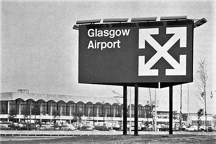
The street signs demonstrated as effective and mainstream as their motorway signage and components of their plan have been utilized in incalculable different nations. Kinneir and Calvert proceeded to finish other public area configuration ventures. The Rail Alphabet typeface they intended for British Rail was essential for the yearning 1964 personality program that included cutlery by the metalware creator David Mellor and the rail image made by Gerald Barney of the Design Research Unit. They likewise worked for clinics and the military, and planned signage for air terminals in Melbourne, Sydney, and Bahrain, just as for the Tyne and Weir Metro. Both Kinneir and Calvert were instructed at the Royal College of Art, where each had a spell as a top of the visual computerization division[3].
Death of Jock Kinneir:
Jock Kinneir died in 1994, however, his work has stayed an enduring recognition for him. His street signage framework has been changed throughout the long term, and its enthusiasts frequently gripe that Britain’s street signs have gotten dynamically sloppier. It adjusted well to brown foundation getting paperwork done for vacation destinations during the 1980s, yet then experienced fairly 1994 onwards with the presentation of enormous shaded boards – signs inside signs. It is a declaration to the thoroughness of Kinneir and Calvert’s unique work that their textual styles, pictograms, and the vast majority of their plan rules are as yet being used today, having been incorporated into the PC programming utilized for sign plan and production. Notwithstanding, it is a sad side-effect of this digitization cycle that a few images have lost their freshness and unmistakable attributes because of continued remembering throughout the long term[3].
As Kinneir recognized, similar to all models of data plan, his and Calvert’s street signs satisfy their capacity so productively that the public will, in general, underestimate them and once in a while recognizes their plan merits[3].
Directions of Signs and Street Names:
It is tragic however consistent with the state that the greater part of us underestimate our environmental factors,” Kinneir saw in 1965. “Course signs and road names, for example, are as crucial as a drop of oil in a motor, without which the moving parts would seize up; one can picture the impact of the evacuation of this class of data on drivers in a bustling city or on walkers attempting to discover their way in an enormous structure complex. It is a need that has reared a sub-division of visual depiction with more impact on the presence of our environmental factors than some other[3].
References:
1. wikipedia. 11th December 2020; Available from: Wikipedia
2. hatchedlondon. 11th December 2020; Available from: hatchedlondon.
3. britishroadsignproject, 11th December 2020; Available from: britishroadsignproject